Building a Scalable Design System
Flowstate
2023
Design Systems, UI/UX, Documentation, Development

Overview
Flowstate is a workflow automation platform that had grown rapidly over four years. With growth came fragmentation—three product teams, no shared design language, and a user experience that felt like three different products stitched together.
The Challenge
The symptoms were clear:
- Users reported confusion when moving between product areas
- Designers spent 40% of their time recreating existing patterns
- Developers implemented the same components differently across teams
- Accessibility was inconsistent, creating legal exposure
The root cause was organizational. Each team had optimized locally without a shared foundation. The solution needed to be both technical and cultural.
Our Approach
Audit & Inventory
We began by documenting everything. Over three weeks, we:
- Cataloged 847 unique UI elements across the product
- Identified 23 different button styles (there should have been 4)
- Mapped inconsistent spacing, typography, and color usage
- Interviewed designers and developers about pain points
Design Principles
Before creating components, we established principles that would guide every decision:
- Clarity over decoration — Every element earns its place
- Consistency breeds confidence — Same problem, same solution
- Accessible by default — WCAG AA as the baseline, not the goal
- Developer experience matters — Well-documented, easy to implement
Component Architecture
We designed a three-tier system:
Primitives — The atomic building blocks
- Color tokens with semantic naming
- Typography scale with responsive behavior
- Spacing system based on 4px grid
- Motion tokens for consistent animation
Components — Reusable UI elements
- 34 components covering 90% of use cases
- Each with multiple variants and states
- Fully accessible with keyboard and screen reader support
- Comprehensive prop documentation
Patterns — Composed solutions for common problems
- Form layouts and validation
- Data tables with sorting and filtering
- Navigation patterns
- Empty states and error handling
Documentation & Tooling
A design system is only as good as its documentation. We built:
- Figma library with 1:1 component parity
- Storybook with interactive examples and code snippets
- Usage guidelines explaining when and how to use each component
- Contribution process for proposing additions

The Outcome
Six months after launch, the impact was measurable:
- 60% reduction in design-to-development time
- 100% WCAG AA compliance across all components
- Zero accessibility-related support tickets (down from ~15/month)
- 45% fewer design review cycles due to shared language
Qualitatively, the teams reported feeling like one product organization for the first time.
“The design system changed how we work. Decisions that used to take days now take minutes because we have a shared language.”
— David Park, VP of Product, Flowstate
Sustainability
A design system is a living product. We helped Flowstate establish:
- Monthly “office hours” for questions and feedback
- Quarterly reviews to assess adoption and identify gaps
- A clear governance model for additions and changes
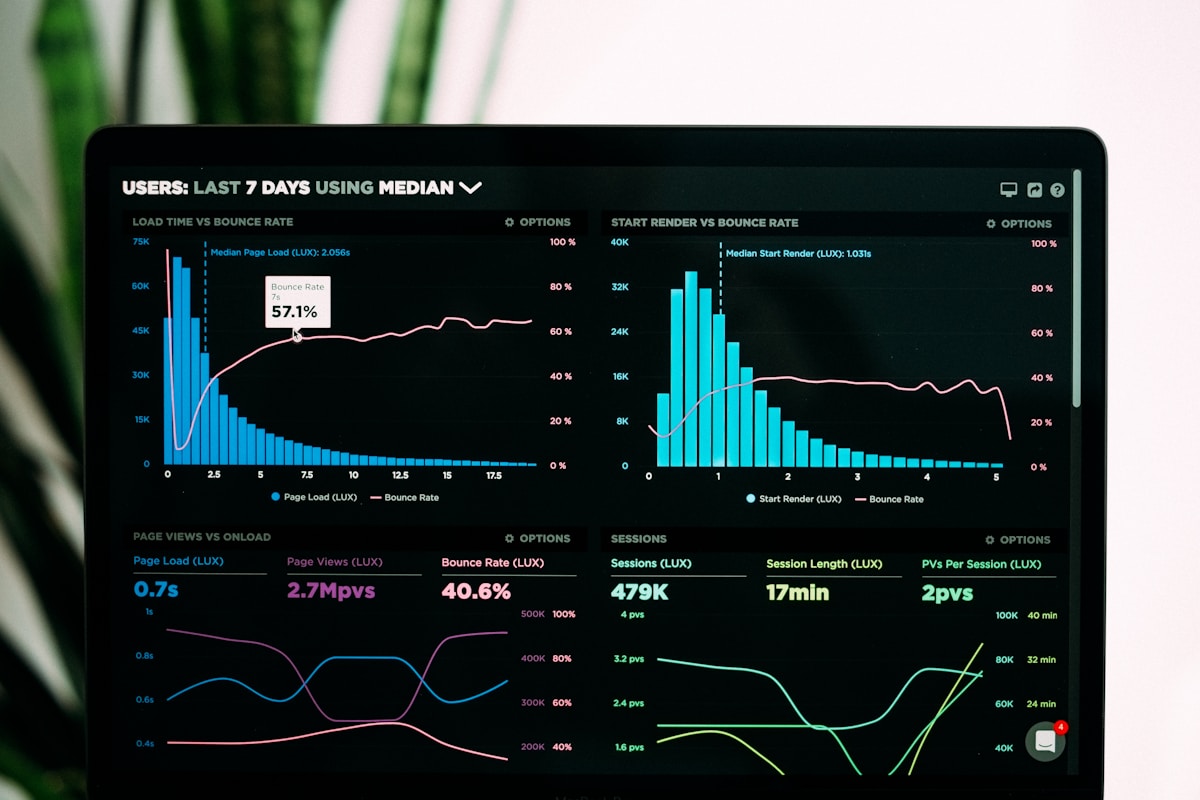
- Metrics dashboard tracking usage across the product
The system now has 94% adoption across teams and continues to evolve with the product.